

MENTIMETER - COMPETENCE & PORTFOLIO SESSION
This page brings together the two cases selected for the Mentimeter team, chosen to reflect the intersection of what this role brings together:
Creative and Technology-driven thinking on one side, and Brand Identity with strategic conviction on the other.
Each project shows a different dimension of my process, from large-scale retail innovation built with dev and marketing teams,
to brand identities shaped by cultural nuance and strategic conviction.
CONCEPT CREATION / CREATIVE LEAD
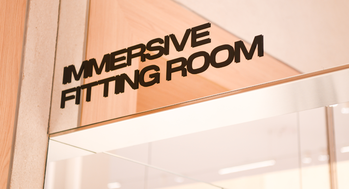
IFR - H&M
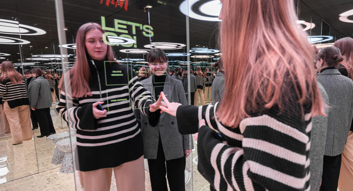
V1 - Interactive Fitting Room
When I joined H&M, the first version of the IFR was already finishing its prototype stage. I visited the space, travelled to La Coruña to follow the production build,
connected with the music teams to curate the soundtrack, and designed the UX/UI drafts for the screens, defining how colours and lights would interact with the music inside.
The result was an instant hit with a Gen Z and young female audience. Long queues, strong TikTok presence, and a party-room energy that resonated.
Store: Barcelona (Spain).
V2 - Initial Concept
THE UPGRADE
But something important was missing: the product.
H&M's clothing was barely visible inside, almost completely secondary to the experience. I didn't agree with that direction
and that became the driving force behind pushing for a full upgrade of the shell, structure, and experience itself.
The idea came with an immediate concern from the company: costs.
The fear was that adding floor and ceiling screens would make it significantly more expensive than the original setup.
So I took it upon myself to chase external partners, and found collaborators we had worked with before who were excited about the project
and confirmed they could match the existing budget, removing the main barrier to getting sign-off.
SOUNDTRACK YOUR STYLE
In parallel, we connected with a small music startup who had reviewed the concept and believed it was something they could actually build.
The idea:
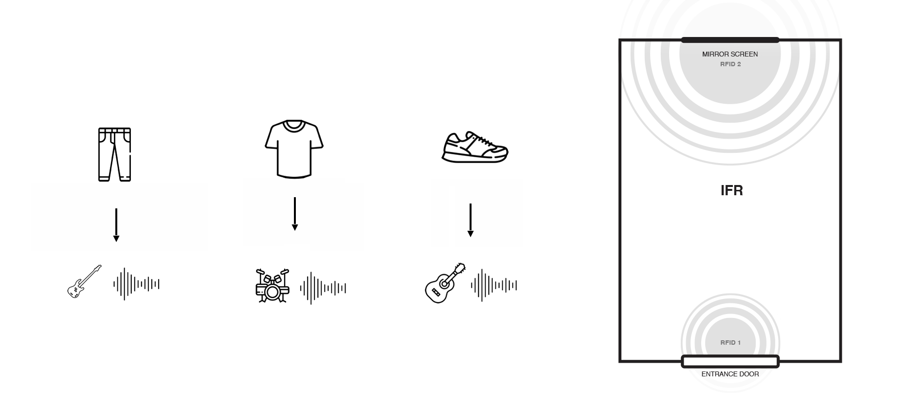
Two RFID readers placed inside the fitting room: one near the door detecting the garments a customer brought in, another by the screen detecting what they were actually wearing.
Every garment was linked to a music stem: vocals, bass, drums, and more, and their combination would generate a unique song in real time.
To create the right genre direction, we established a hierarchy: certain hero garments, like a leather jacket, would define the overall style and genre of the composition,
while all other garments contributed their stems around it. Each genre had its own set of visual content options, matched to the mood and style of the music.
Change one garment and the entire experience shifts: a new stem combination, a new song, a new genre direction, and new visuals playing on the screen to match.
The garment was no longer a backdrop. It was the trigger and the centre of everything.
V2 - Final/Current version
The company decided not to invest in the AI technology development.
The music startup stayed on board, and together we shifted focus to what would become the final version: a fully upgraded shell with a new screen-based UX/UI interaction, a significant evolution from V1.
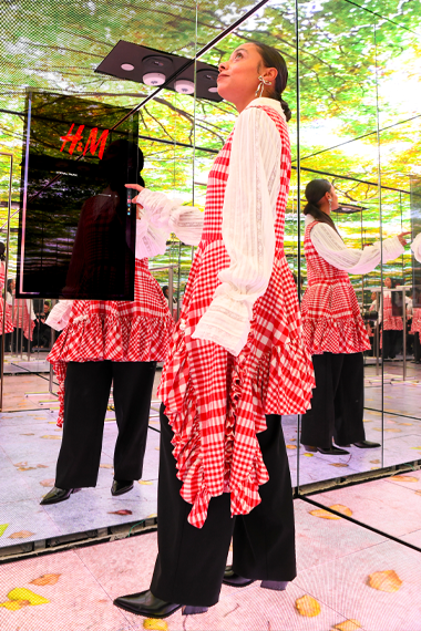
The idea behind the upgrade was simple but powerful: transport the customer to the moment they were actually buying for.
Buying a bikini? See how it looks under a blue sky.
A dress for a night out with friends? Try it under club lights.
Going to a concert? Feel the energy of that space.
The fitting room would reflect the real context of the purchase, not just a neutral white box.
At the same time, a full neutral light option was always available, giving customers both worlds.
As Creative Lead, I was responsible for the concept, creative direction, UX/UI and cross-functional development of the upgraded fitting room,
collaborating with dev, marketing, music partners, content teams, and store designers across multiple countries and timezones.
UX/UI:
One of the key improvements over V1 was simplicity. The original version required too many steps before the experience could begin, even if intuitive, it was too long.
In V2, I redesigned the interaction around six moods presented directly on screen from the moment you walked in.
No setup, no navigation, just six clear choices. Each mood had a name, localised per market, inspired by neighbourhoods,
moments and vibes: think "Morning Walk" or "Picnic in the Park." Immediate, personal, and ready to use.
I designed the UX/UI in Figma and supervised the UX designer who brought it to pixel-perfect execution.
Screens:
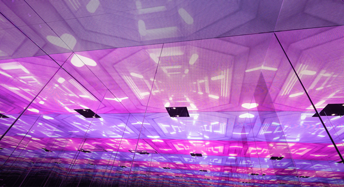
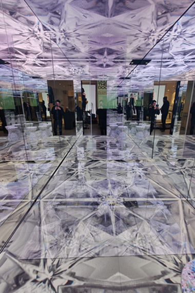
The mesh screens on the ceiling were a deliberate choice: hiding the speakers behind them while the rectangular shape created a sense of infinity, amplifying the immersive quality of the content.
The floor experience starts as a digital reproduction of the store floor, seamless with the outside, so the transition felt natural until the experience took over and the surprise hit.
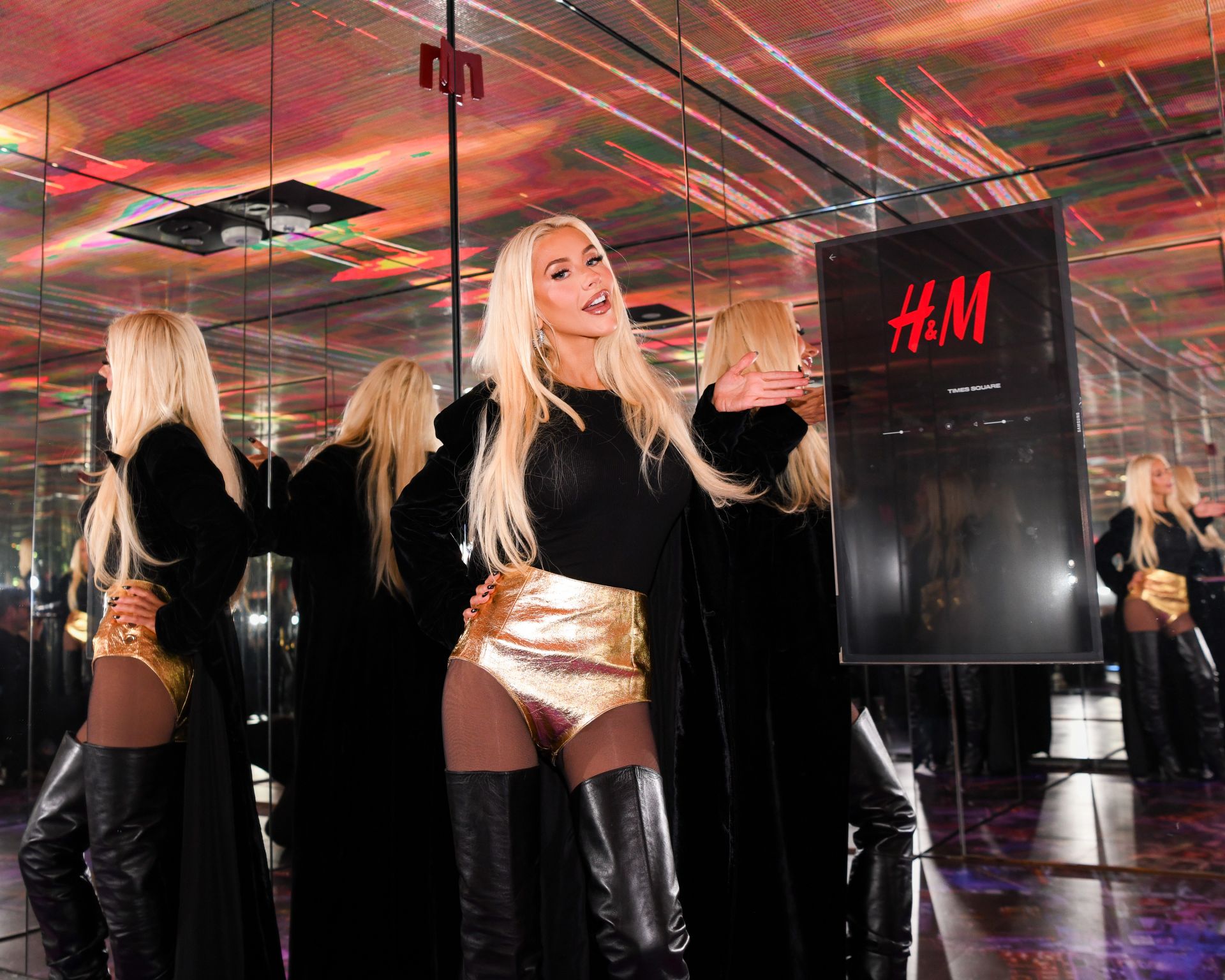
Mirror Screen:
The interaction was built on a touchscreen embedded in the mirror, creating a seamless 360 experience inside the fitting room.
Music:
Music was handled with an external partner, with my final creative sign-off.
Visuals:
I wanted AI-generated content but that wasn't possible at the time due to internal constraints, so we used curated stock content instead.
All screen content was selected and edited by me. Content was refreshed every quarter to keep the experience current,
and special collections triggered short-term updates — timed to campaign launches to create an extra boost of brand visibility and in-store energy at key moments.
Exterior Design:
I also collaborated with the architects and in-store designers to ensure the exterior of the IFR was a natural fit for both the experience inside and the wider store environment.
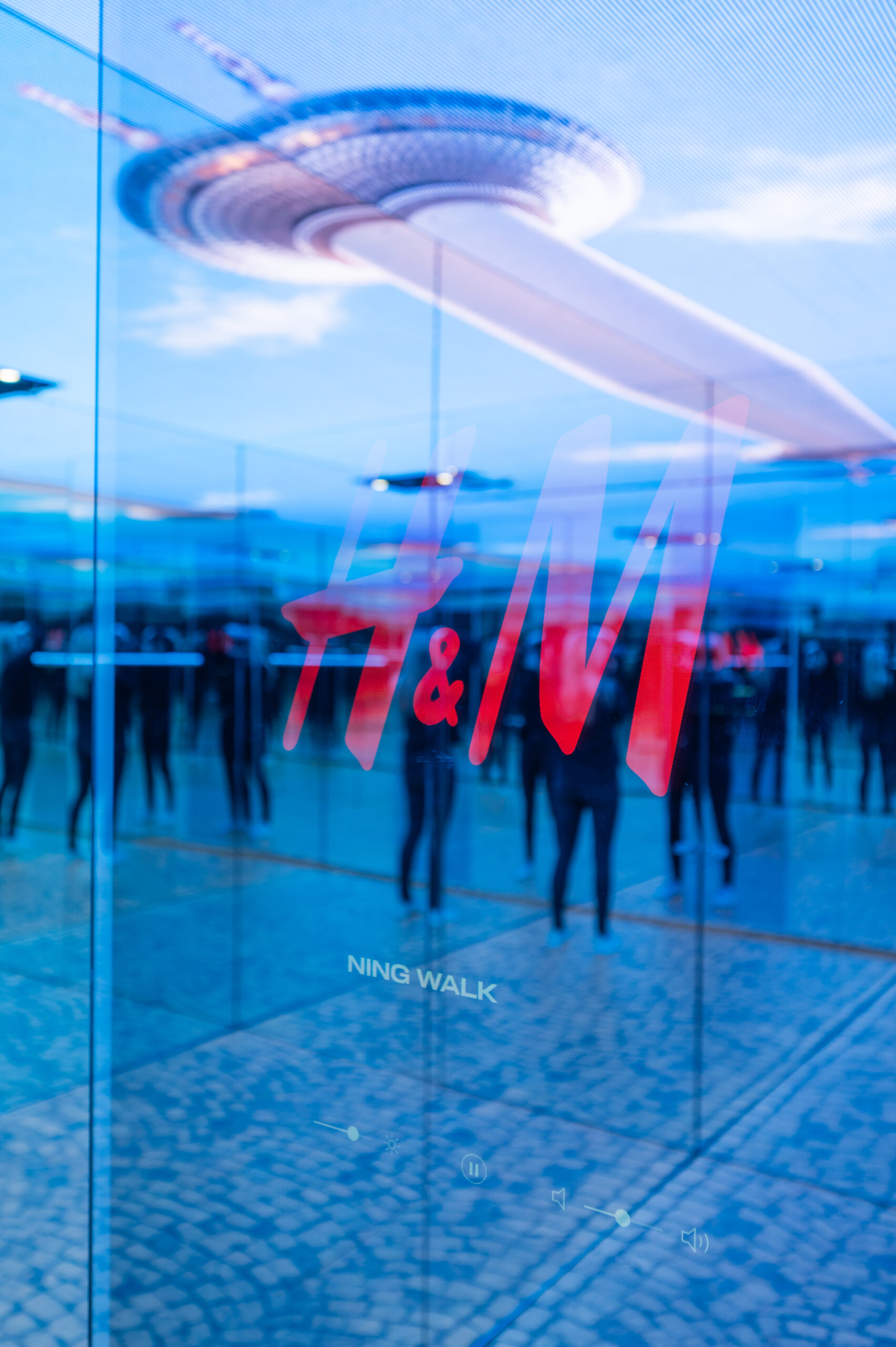
After installing in Berlin, we renamed it from Interactive to Immersive Fitting Room — because that's exactly what it had become.
Across Barcelona and Berlin, the IFR generated more than 11 million TikTok views, over 1.5 million likes, over 150,000 shares, and nearly 14,000 comments.
Stores: Berlin (Germany), Seoul (Korea), NYC -Times Square (USA), Dubai (UAE).
Across Barcelona and Berlin, the IFR generated more than 11 million TikTok views, over 1.5 million likes, over 150,000 shares, and nearly 14,000 comments.
GRAPHIC DESIGN / ART DIRECTION / BRAND IDENTITY
BRAND ID - QATAR
Two brand identity projects developed while I worked in Doha, Qatar — each presenting a distinct creative challenge, and each requiring a different kind of strategic and cultural thinking to solve.
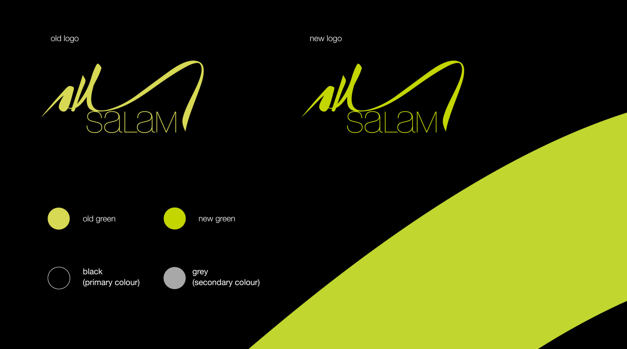
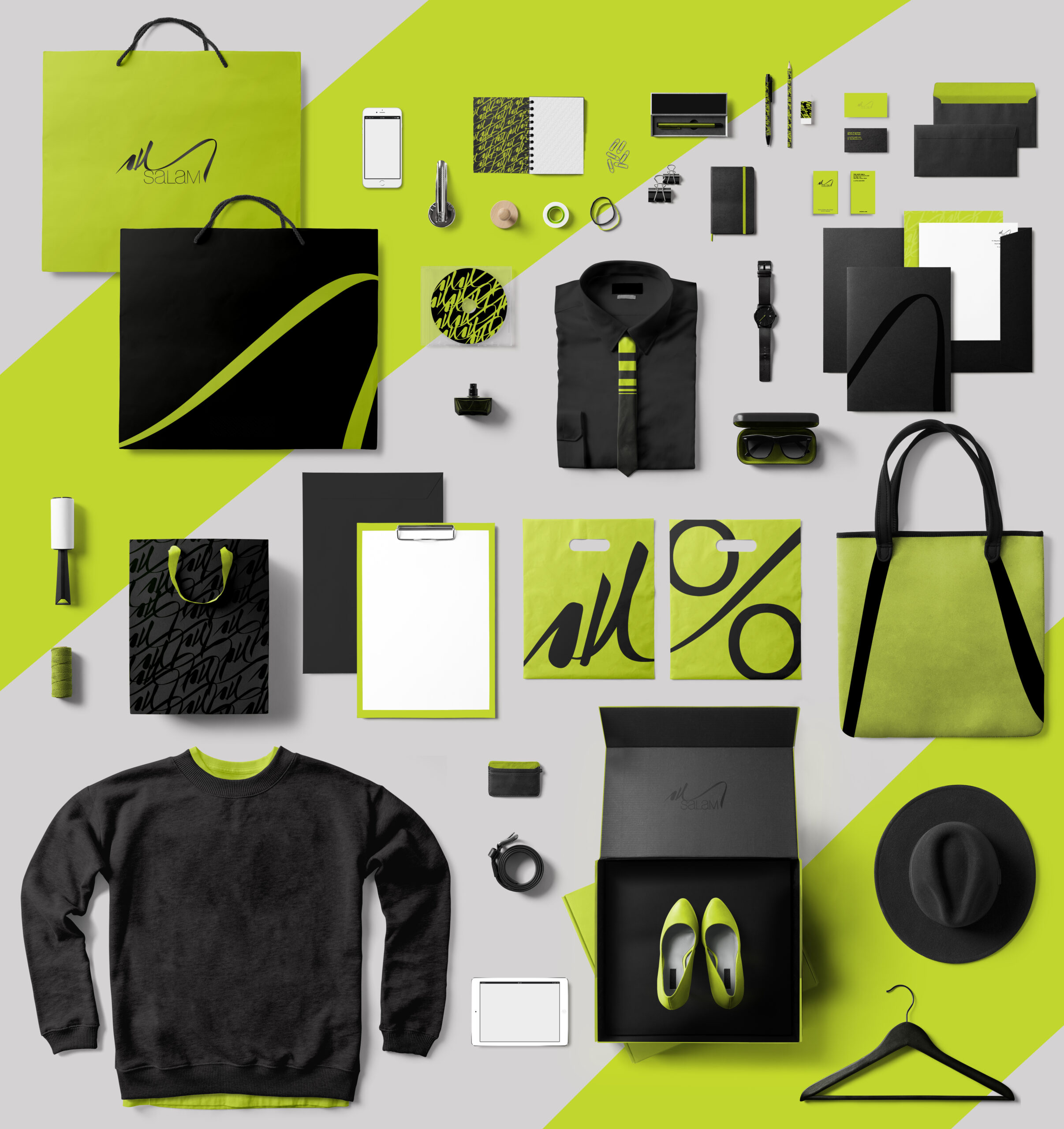
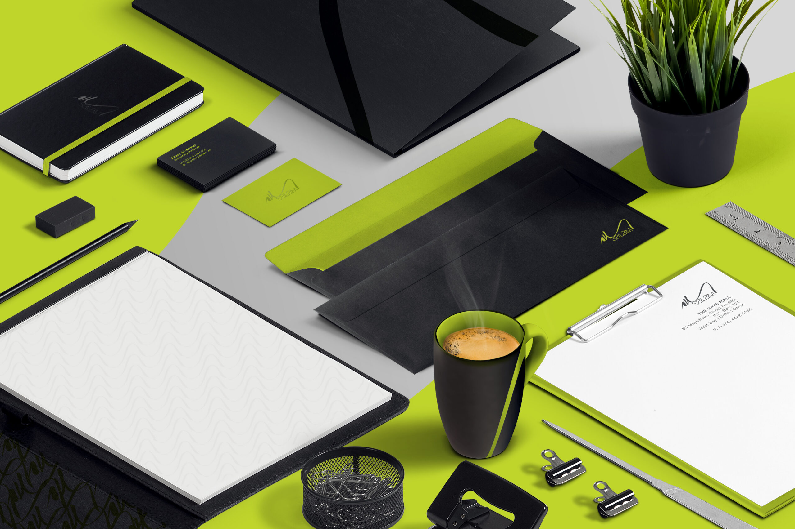
Salam Stores
As Senior Art Director, I was commissioned to develop a full brand refresh for Salam, the Middle East's most prestigious luxury and consumer products retailer, based in Doha, Qatar.
The project involved an in-depth research phase, studying how leading luxury and lifestyle brands globally were approaching their visual identities,
before developing a creative direction that honoured Salam's heritage while giving it a confident, modern edge.
The result was a colour-led identity that positioned Salam as a brand in its own right, distinct from the luxury labels it carries.
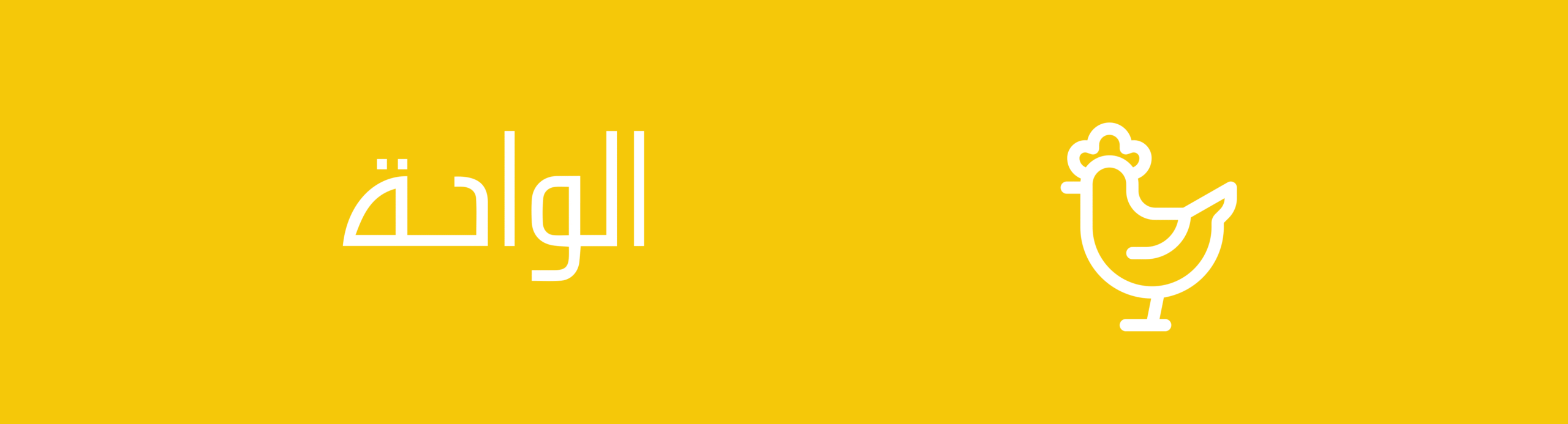
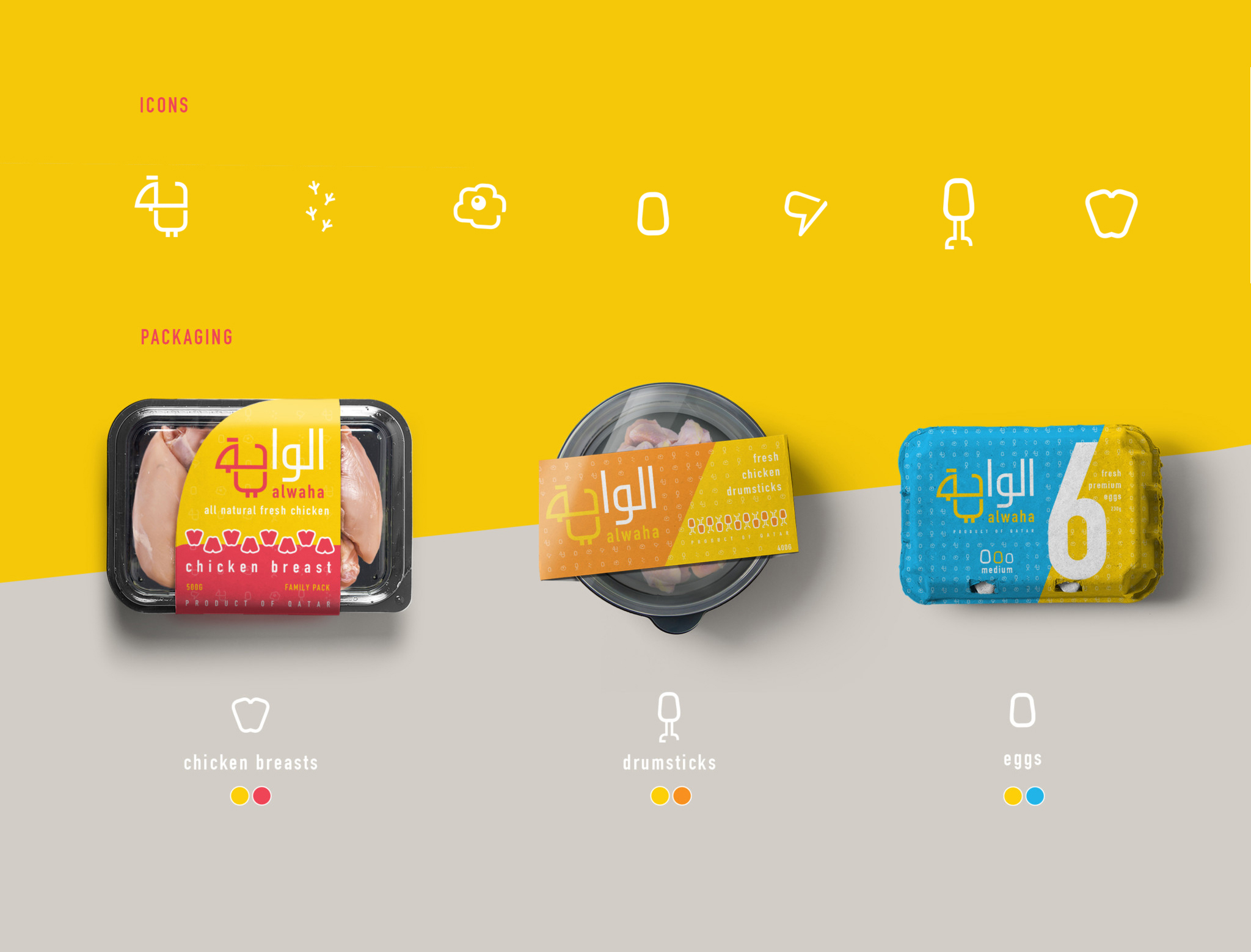
Al Waha
As Senior Art Director, I was commissioned to create a new brand identity for Al Waha — one of Qatar's largest poultry companies.
The solution fused culture and symbolism: a chicken silhouette embedded within the Arabic lettering of the word Al-Waha.
he design was crafted to be equally relevant for both Western and Arabic readers — one immediately sees the animal, the other first reads the word, and only then discovers the shape within it.
To ensure the concept worked across both cultures, the solution was tested with Arabic-speaking colleagues before finalising — a small but essential step in making the dual-reading truly land.
The result was a layered, cross-cultural identity that felt both locally rooted and internationally accessible.
Tiago Oliveira
hello@tiagois.me
LinkedIn ↵